They watch a two-minute video on phishing, answer three quick questions to test their instincts, and earn points immediately. By Friday, the HR manager can see exactly who has completed the training and who needs a nudge. This isn’t just a concept; it’s the core functionality of TETRA.
In the first article of this series, we met the student team behind the project. Now, we shift our focus to the application itself: what the learner actually experiences, how the admin builds that experience, and why we chose a structure that keeps them both on the same page.
Role-based views: dRole-based views: different needs, one structure
In most organizations, the person taking the training and the person creating it have very different needs. The learner needs speed and clarity: What do I need to do next? The admin need control and oversight: Is the content consistent? Has everyone finished it?
TETRA separates these needs into distinct views but builds them on a single, shared backbone: Module → Unit → Content Block.
Why does this shared structure matter? In many training tools, admins work in a complex backend that looks nothing like the final product. This leads to a disconnect where the training looks good on paper but feels clunky in practice. By forcing both roles to use the same hierarchy, TETRA ensures that when an HR manager adds “one more unit,” they know exactly how it will appear to the user. This shared model makes the tool understandable also for non-technical users.
Learner journey: short, focused and gamified
The complete learner journey from logging in to completing a module is shown in Figure 1. The learner’s journey is designed to be linear and rewarding. It removes the guesswork of “where do I click?” and replaces it with a clear path forward.
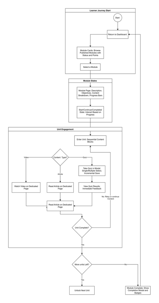
When a learner logs in, they land on a personal dashboard. It shows total points, active modules and how far they have progressed in each. Course modules appear as cards with statuses:
- Not Started: Ready to begin.
- In progress: Pick up exactly where you left off last time
- Completed: A record of achievement.
At a glance, the learner can see both where to begin and what they have already achieved.
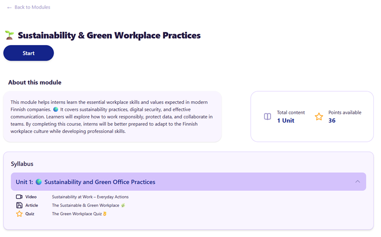
Opening a module gives a full overview: description, learning objectives, total points and a progress bar. The system guides the user with states like: Start, Continue or Completed. Figure 2 shows module not yet started.
Learning in “Units”
The actual learning happens inside Units. A unit is a container for Content Blocks: videos, articles, and quizzes. Crucially, the system enforces order: you cannot watch the Step 2 video before finishing the Step 1 article. This means learners follow the path the trainer designed, and progress can be tracked in real time.
Different content types inside units behave differently. Videos and articles open on their own page, so the learner can focus without distractions. Quizzes open in a modal on top of the current page, so the learner stays in context and can continue immediately afterwards. At the moment quizzes support both single- and multi-select questions, giving instant feedback and points. This structure turns static onboarding material into an interactive, gamified flow where every piece of content can reward the learner, which was one of the main goals of the project.
Admin view: from idea to published training
While the learner enjoys a smooth, guided path, the admin needs a powerful backstage to orchestrate it. The Admin View is the control center for creating content, managing users, and tracking results, as shown in Figure 3. At a glance, admins can jump straight to user management, module management or content validation without hunting through menus. Those blocks form the starting point for all configuration work: who can use the system, what modules exist and which pieces of content are ready to go live.
The Admin Dashboard provides the big picture at a glance: active users, published modules, and completion rates, as illustrated in Figure 4. From here, the admin can navigate to the Module editor, tool they need most
The content creation workflow
Creating a course follows the same logic the learner sees:
- Create Module: Give it a title, description, and cover image.
- Add Units: Break the topic into days or themes (e.g., “Monday: Phishing”).
- Attach Content: Link videos, write articles in a rich-text editor, or build interactive quizzes.
Admins can work safely in a Draft mode. A module remains invisible to learners until it is explicitly Published. The system even runs validation checks—for example, it won’t let you publish a module that has empty units—ensuring that learners never encounter broken or unfinished content.
Returning to our cybersecurity week example, the HR or IT security person starts by creating a new module and naming it Cybersecurity Week. They add five units, labelled Monday to Friday, and within each unit they attach the actual content: a short introduction video, a couple of article blocks with concrete tips, and one or two quizzes that mirror the kinds of emails or messages employees might encounter in real life. They can easily adjust the order, change questions or tweak explanations directly in the editor without touching any code. When they are satisfied, they keep the module as a draft until management has had a chance to review it – and only then do they hit Publish, making it visible to all employees.
Why this matters for companies
In practice TETRA supports the whole lifecycle of digital training. A trainer or HR person creates a module and breaks it into units, adds real content as videos, articles and quizzes, and keeps it as a draft until everything is ready. When the module is published, only the final version becomes visible to the learners. Learners then complete the content in the order defined for them, and the system tracks their progress, points and completion status in real time. At the same time the organisation can be confident that the content always opens in the right order, that no unfinished material is shown, and that role-based access keeps administration and learning clearly separate.
For SMEs this is a practical combination: a platform that is structured enough to be reliable, but flexible enough to be maintained in-house. That cybersecurity week example, an onboarding path for new employees or a short AI awareness campaign can be built and updated by the people who know the topic best. There is no need to launch a separate IT project every time a regulation changes, a new product is introduced, or a new theme week is planned.
What comes next
The goal for this project was to prove that a student team could build the entire “create–publish–complete–track” chain. They succeeded, creating an application that balances gamified fun with serious utility.
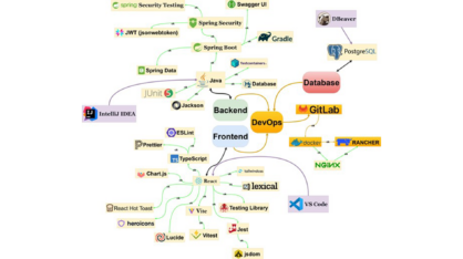
This article covered the functional side: what the user sees. But how does the system actually work under the hood? In the next part of the series, we will dive into the Technical Architecture, exploring the React frontend, the Spring Boot backend, and the modern tech stack that powers TETRA.
This text has been produced as part of the project “RDI Path for SMEs” (1 Jan 2024–31 Dec 2025) coordinated by Vaasa University of Applied Sciences. The project is funded by the ELY Centre and aims to promote the growth of RDI activities of SMEs in the West Coast region and their cooperation with regional RDI actors. The project seeks to strengthen companies’ capabilities for developing innovations, internationalization and sustainable growth through multidisciplinary education, development activities and networked collaboration. The project is implemented in cooperation between Vaasa University of Applied Sciences, Centria University of Applied Sciences and Turku University of Applied Sciences.